
EDIT: After posting this to several typography-specific Reddit pages, there were a lot of comments informing me that the typeface was originally called Shatter. Shatter is available from Letraset directly (the original foundry); Glass Houses was a digitization done in 1999 by a group named Digital Graphic Labs. Even more info can be found here.
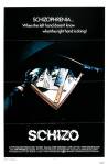
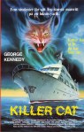
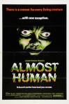
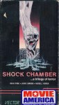
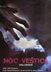
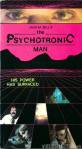
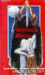
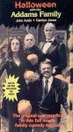
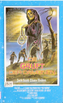
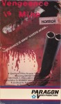
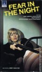
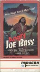
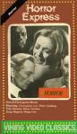
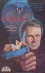
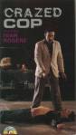
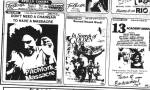
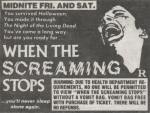
For those readers unaware, I have an obsessive eye for mundane details (check out these photo sets from my Facebook page if you don’t believe me.) Be it scenes from movies or simply the VHS box covers themselves, nothing is safe from my obsessive ocular observances. When it comes to the box art, I’m enamored by more than just the beautifully cheesy, cryptic paintings that adorn the covers — I’m also really into the typefaces used. That being said, I started noticing one font being used more than any other on all these old horror VHS boxes and posters. The font goes by “Glass Houses” and sometimes “Lower-West Side”, and it’s instantly recognizable. It’s even been used on the cover for the AC/DC album Powerage. But let’s focus on the VHS box art. Below is a collection of boxes and other places it’s been used. Images properly credited where applicable. And while I won’t be updating this page regularly, I will be updating the Facebook album where I’ve collected all of them, so be sure to check there for the most recent additions. Lastly, if you, brave reader, have any other examples of this beautiful typeface popping up on horror or sci-fi-related goodies, please email me! Now without further ado…


3 thoughts on “An Ode to “Glass Houses” / “Lower-West Side” typeface!”